


| Author: Abdullah Ahmed | Category: UI/UX Design
A prospective customer arrives on a service page from a search result. The page explains the service, but the menu uses internal department names and the contact route is hidden behind an unfamiliar label. The visitor can read the information yet cannot confidently decide where to go next. That is a navigation problem, even if every link works.
Website navigation connects a person's intention to the information or action that serves it. It includes menus, contextual links, breadcrumbs, search and the cues that explain where someone is. A useful design makes those elements work together rather than expecting the main menu to carry the entire website.
For business owners and product teams, the goal is successful movement through meaningful tasks. More menu clicks are not necessarily better engagement, and fewer clicks do not necessarily indicate an easier journey. People need to recognise promising choices and understand the result of choosing them.
Learn the questions people bring to the site
Begin with the tasks your audience is trying to complete. A new customer may compare services, an existing customer may need support and a potential employee may look for vacancies. These tasks can share a website without deserving identical prominence on every page.
Use enquiries, support requests, search terms and user conversations to identify the language people use. Separate evidence from assumptions made by internal stakeholders. A department's preferred label may mean little to someone encountering the organisation for the first time.
Select a manageable set of important tasks for evaluation. Include at least one journey that begins away from the homepage. People arriving through an article, product page or shared document still need enough context to orient themselves.
Describe success in observable terms. “Find the service's eligibility conditions and reach the enquiry form” can be tested. “Improve discoverability” is a useful ambition but needs a concrete task before the team can judge a design.
Build the information structure before polishing the menu
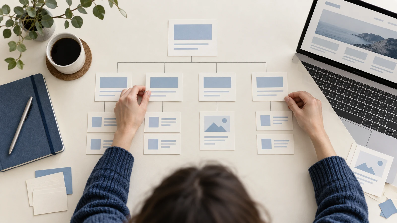
Inventory the content and identify relationships that matter to users. Grouping by service, audience, task or subject can each be appropriate in different contexts. Choose a structure that reflects how people look for information rather than simply copying the organisation chart.
Check whether content belongs in more than one journey. A funding guide might help both new applicants and existing participants. It can have one authoritative location while being linked from several relevant places; duplication is not the only way to support multiple routes.
Resolve overlap between categories. If two menu labels sound interchangeable, visitors must guess which contains the answer. Define what each category includes and test the distinction with real examples. Sometimes the right correction is to merge categories or rewrite their labels.
Keep the proposed structure independent of the visual layout long enough to evaluate it. A beautifully styled menu can conceal a confusing hierarchy. A simple text tree can expose that problem before the team invests in interaction details.
Choose labels that predict the destination
A navigation label is a promise. It should give enough information for someone to decide whether the destination is relevant. Prefer familiar, specific language over clever wording that requires interpretation, especially for essential actions such as support or contact.
Match labels to the content users will find. A link called “Pricing” should not lead only to a broad sales message with no explanation of costs or how to obtain them. If the destination is a quotation process, say so clearly.
Use consistent wording for the same destination across the site unless the surrounding context provides a good reason for variation. Arbitrary synonyms can make people think there are separate resources. Keep a small naming record for important sections so future editors preserve the distinction.
Review labels in context and at realistic widths. A label that is understandable in a spreadsheet may become ambiguous when shortened in a mobile header. Avoid truncating away the word that distinguishes one choice from another.
Divide navigation by purpose
Global navigation provides access to the site's principal areas. Local navigation helps within a section. Utility links support functions such as account access or language selection. Contextual links connect information at the point where a reader needs it.
These layers should be distinguishable without becoming visually noisy. A visitor should not have to compare several equally dominant rows of links to find the main route. Establish priority according to the task and the page's role.
Do not put every destination in the global menu because every internal team wants visibility. A section landing page can introduce related options with descriptions and useful context. That may be easier to understand than a very large header containing unexplained labels.
Likewise, do not remove useful routes simply to achieve visual minimalism. A hidden menu can reduce clutter but also conceal choices. Evaluate whether the audience can find the relevant task in the actual design rather than applying a universal rule about how many links a header should contain.
Make menus work with different input methods
The W3C WAI menus tutorial explains the importance of appropriate structure, recognisable states and keyboard-operable submenus. A menu that works only while a pointer hovers over a precise area excludes other ways of interacting with the site.
Use semantic navigation and ordinary links for destinations. If a control expands a submenu, give that action an appropriate control and communicate its state. Avoid making users guess whether selecting the same label will navigate, expand or do both.
Test the focus sequence through the complete header. People using a keyboard need to see which control is active and reach the page content without unreasonable repetition. Ensure an open overlay does not leave focus moving invisibly through obscured controls.
Check touch behaviour separately. Submenus should remain usable without relying on hover, and nearby targets should be distinguishable enough for comfortable selection. Test on real devices, including cases where labels wrap or the browser's text size increases.
Explain the current location
A clear page title, an appropriate active navigation state and meaningful section context help visitors understand where they have arrived. These cues become especially valuable on large sites and on pages reached directly from external links.
Breadcrumbs can express a page's position in the information hierarchy. They should describe a useful route through that structure rather than pretend to be a record of the visitor's actual browsing history. Choose the hierarchy deliberately when a page can be reached through several paths.
Use current-page states consistently and avoid relying on colour alone. The distinction should remain understandable when someone cannot perceive the selected colour or uses a different display mode. Test the actual implementation rather than only a design screenshot.
Provide an understandable way back to a broader context. A detailed guide may need a link to its topic collection, while a product page may benefit from access to the category. The browser back button remains useful, but it cannot supply context for someone whose first visit begins on that page.
Let contextual links carry the conversation
A reader's next question often emerges while reading. Link to a relevant explanation or action where it becomes useful, using text that describes the destination. A repeated “learn more” label can be less informative when links are encountered outside their immediate visual context.
Avoid turning every paragraph into a collection of competing exits. Choose links that support the current task and distinguish a necessary next step from optional background. Too many equally prominent actions can make a page harder to complete.
Review the end of important pages. After explaining a service, the page might help visitors assess suitability, view a relevant example or begin an enquiry. Choose the next step based on what the page has prepared them to do.
Maintain those relationships when content changes. Removing a guide or renaming a service can leave contextual links misleading even if they do not produce a technical error. Content review should include whether the destination still fulfils the link's promise.
Treat search as a complementary route
Search can be valuable when visitors know a term or when the content collection is large. It should not become the sole escape route from a confusing structure. Improve both the organisation of content and the quality of retrieval.
Inspect common searches and zero-result queries with appropriate privacy controls. Look for vocabulary the site does not recognise, missing content and repeated attempts to find a specific task. A zero-result search may indicate a content gap rather than a ranking problem.
Make results distinguishable. Titles, summaries and relevant content-type cues help people choose between similar items. A list of identical-looking page names gives little support even when the correct answer is technically present.
Provide a useful empty state. Explain that no results were found, preserve the query and suggest a practical next step such as checking terms or browsing a relevant category. Do not silently replace the query with unrelated popular content while implying that it answered the request.
Preserve meaning across screen sizes
A responsive design may reorganise navigation, but essential destinations should remain available and recognisable. Mobile visitors are not necessarily interested in a smaller subset of the business. They may be performing the same important task under different conditions.
Test the menu with long labels, translated text and enlarged text. Content changes can expose layout assumptions that a narrow set of sample labels never reveals. The interaction should remain usable without clipping the decisive part of a choice.
Keep page state coherent when the viewport changes. An open mobile menu should not leave an invisible overlay or inaccessible focus position after switching orientation or resizing. These transition cases are easy to miss when desktop and mobile views are reviewed separately.
Check sticky headers against the reading and navigation task. Persistent access can help, but a large header may obscure content or focused elements. Evaluate the space it consumes on the actual devices used by the audience.
Test structure and interaction separately
A tree test can examine whether people find information within a proposed text hierarchy. Give participants a task and observe their chosen route. This helps diagnose grouping and labels without the distraction of visual presentation.
An interactive usability session then tests the actual menu, page cues and contextual links. Watch where participants hesitate, backtrack or misunderstand a destination. Ask follow-up questions after the attempt rather than coaching them toward the intended route.
Use a range of relevant participants, including people unfamiliar with internal terminology. Staff are valuable for checking content accuracy but may already know where information belongs. Their knowledge can hide a label that is unclear to a new visitor.
Keep findings proportionate to the evidence. A small qualitative study can reveal a serious comprehension problem without establishing a universal percentage of affected users. Combine observation with production data when deciding how broadly the issue applies.
Work through a service-directory example
Imagine a maintenance business whose menu lists “Operations,” “Solutions” and “Client Services.” Customers looking for an emergency repair may not know which department owns that task. Internal staff may find the structure obvious because they know the organisation.
A revised structure could expose the service categories using customer language, retain a clear support route and provide an urgent-contact action where appropriate. The exact labels should come from the business's services and audience research, not a generic menu template.
Test an ordinary enquiry and an urgent support request independently. The first visitor may need to compare options, while the second needs an immediate route to help. Giving both the same prominent sales action can make one journey harder.
Now begin each task on a detailed article instead of the homepage. The header and contextual links should still provide a credible route. This catches a common design assumption that every visitor has already read the site's introduction.
Record the result as task evidence: where people first looked, whether the destination matched their expectation and what required correction. Use that evidence to refine the structure before adding decorative interaction. The business gains a navigation decision grounded in customer work rather than stakeholder preference.
Use an evidence sheet for navigation decisions
A compact evidence sheet can stop a menu review from becoming a vote among stakeholders. Give each proposed change a task, a current problem, the supporting observation and a way to evaluate the result. Keep the language understandable to the people who own the content.
| Task | Observed difficulty | Change to evaluate |
|---|---|---|
| Request help with an existing service | Visitors choose a sales destination | A distinct support label and contextual route |
| Compare two service options | Category names overlap | A clearer grouping with short descriptions |
| Return from a detailed guide | The broader topic is unclear | A useful section link or breadcrumb |
These entries are examples, not findings about your website. Populate the sheet from research and actual content. If a proposed change has no evidence yet, label it as a hypothesis and choose a small test instead of presenting it as an established user need.
During the review, ask what the destination must contain to keep the label's promise. A clearer menu cannot compensate for a landing page that mixes unrelated material. The content owner and designer may need to improve the destination together before the navigation change can be judged.
Record competing needs explicitly. A prominent support route may matter to existing customers while new visitors need service comparison. The design can serve both through distinct layers or page context, but the team should explain the priority rather than squeeze everything into one undifferentiated menu.
After release, retain the decision and result. If the change helps a task, that evidence informs later additions. If it does not, review whether the label, grouping or destination remained the obstacle. This makes navigation an evolving information system with accountable decisions instead of a header that is repeatedly redesigned from personal preference.
Assign ownership as the site grows
Navigation tends to deteriorate through individually reasonable additions. One new service becomes a header link, another team creates an overlapping category and a campaign leaves behind a temporary label. Establish who can approve structural changes and what evidence they need.
Keep a simple inventory of major destinations and their purpose. Review it when services change or content is retired. The aim is enough governance to preserve coherence without making ordinary editing unnecessarily difficult.
Monitor important tasks after a redesign. Changes in traffic, content and audience can alter what people need. Investigate repeated failed searches or support requests for information that should be easy to find.
Start your next navigation improvement with three real tasks and the pages where those journeys begin. If users can recognise a route, understand their location and reach a useful outcome, you have a sound basis for the design. Refine the presentation around that evidence.
Author

With over 15 years of diverse experience spanning front-end and back-end development, UI/UX design, project management, integration, testing, and ongoing support for business applications, I specialize in transforming ideas into seamless digital solutions. I’m committed to leveraging my expertise to drive innovation and contribute meaningfully to the tech community.